
1 week branding sprints for IBM's AI incubator products
TIMELINE
1 week each
ROLE
Brand Designer
Motion Designer
TEAM
Individual
SKILLS
Branding
Visual Design
Motion Design
01 — OVERVIEW
One week branding sprints for IBM's AI incubator products
Hyper Blue is IBM’s in-house incubator inviting IBMers to to build the next generation of AI powered businesses. Hyper Blue projects operate as internal start-ups funded by IBM’s clout, client network, and investment to generate $100M of revenue.
I was Hyper Blue's sole designer leading design and research initiatives among 5 products.
TASK
Create a unique brand and identity for Hyper Blue and each of it's products while aligning to the brand standards of IBM.
OUTCOME
I worked with leadership from each product and delivered branding guidelines and marketing assets for their products.

02 — THE CHALLENGE
How might we create new brands under the constraints of a parent brand?
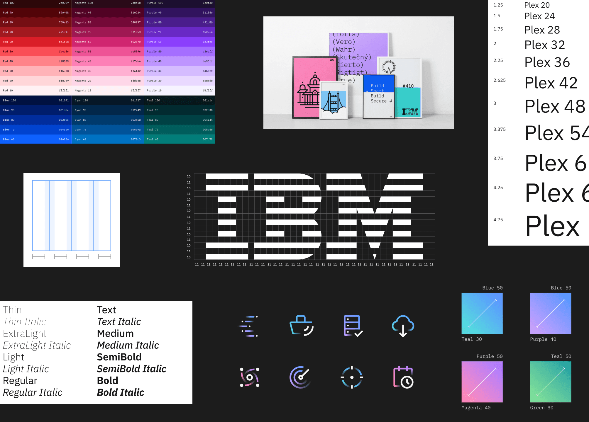
The interesting part of branding an internal start-up is the constraint of working within an existing design language. The IBM design language has defined guidelines for typography, colour, iconography, and grids.
The challenges and constraints
⚠️
Colours and gradients must align to existing colour families and guidelines
⚠️
Logo marks must use IBM Plex without modification
Timeline
An additional challenge was working under a tight schedule of a single week to produce each brand 0-1.

03 — DEFINING
Defining the brand vision with help from product teams
In preparation for the sprints, product teams were given branding homework - a shared document with simple prompts to get their thoughts going and generate a discussion about core values.

What the homework revealed
📖
Individual team members each have their unique outlook on core values
📖
Non-designers are good at referencing other brands and why they like them, or not.
Workshops
For some teams, workshops were conducted to collaboratively brainstorm and better understand ideas and rationale. Voting sessions were done to prioritize and clarify.

03 — EXECUTION
Rapidly iterating on concepts
Logo concepts were explored and narrowed down from feedback and insight from product teams themselves. Constant feedback helped advance the designs.
North Star principles
💭
Allow less to say more.
💭
Iterate with the feedback of product teams.
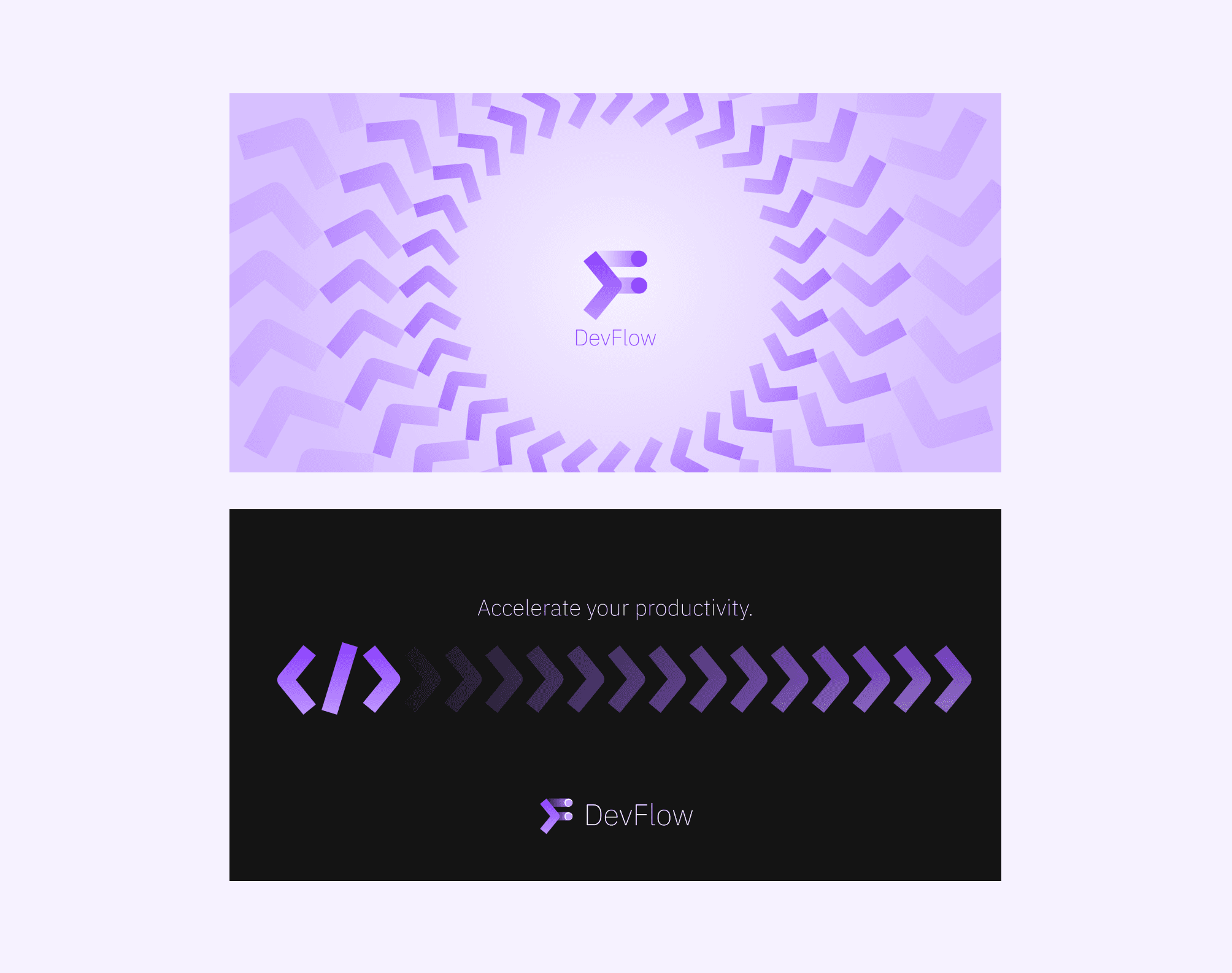
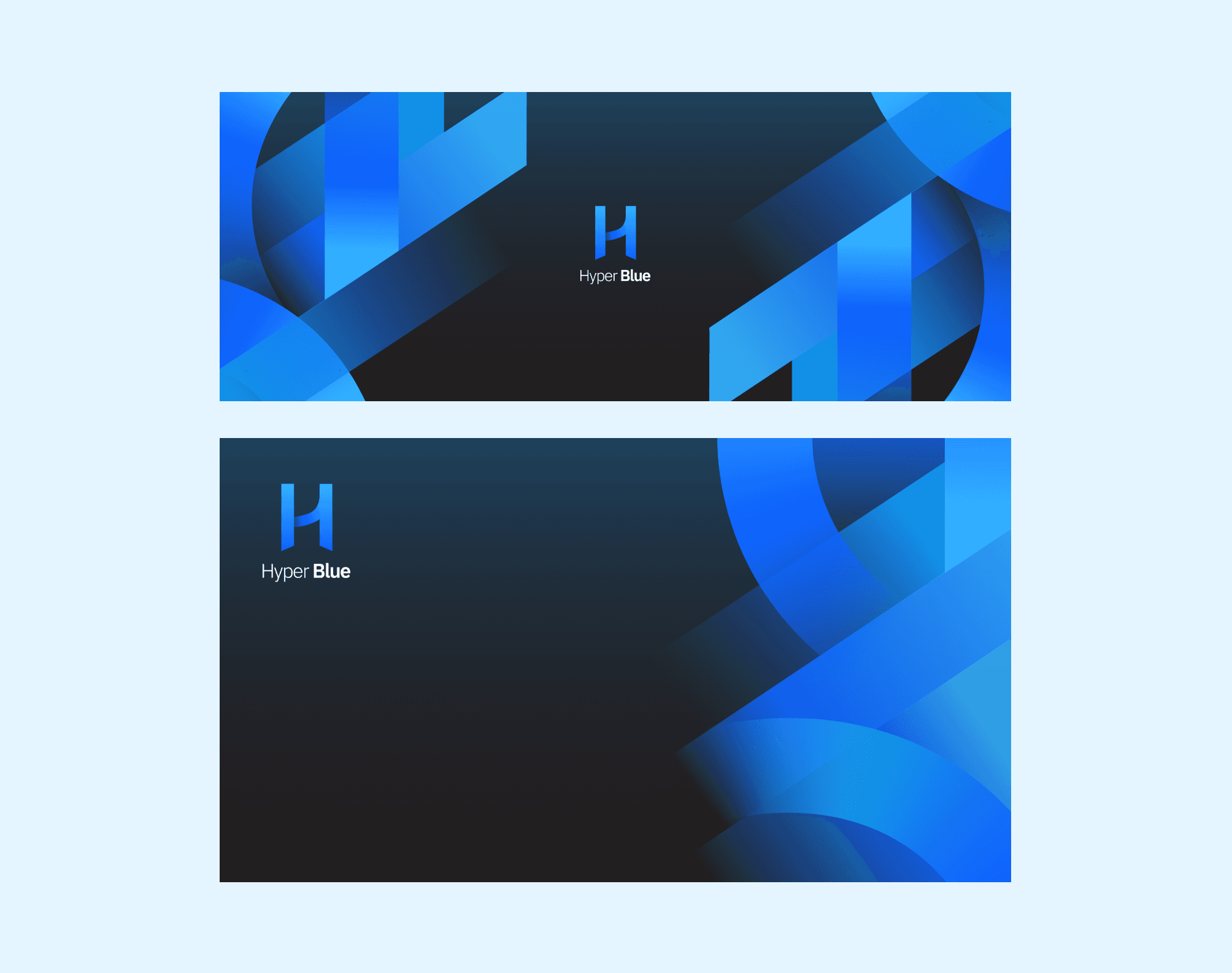
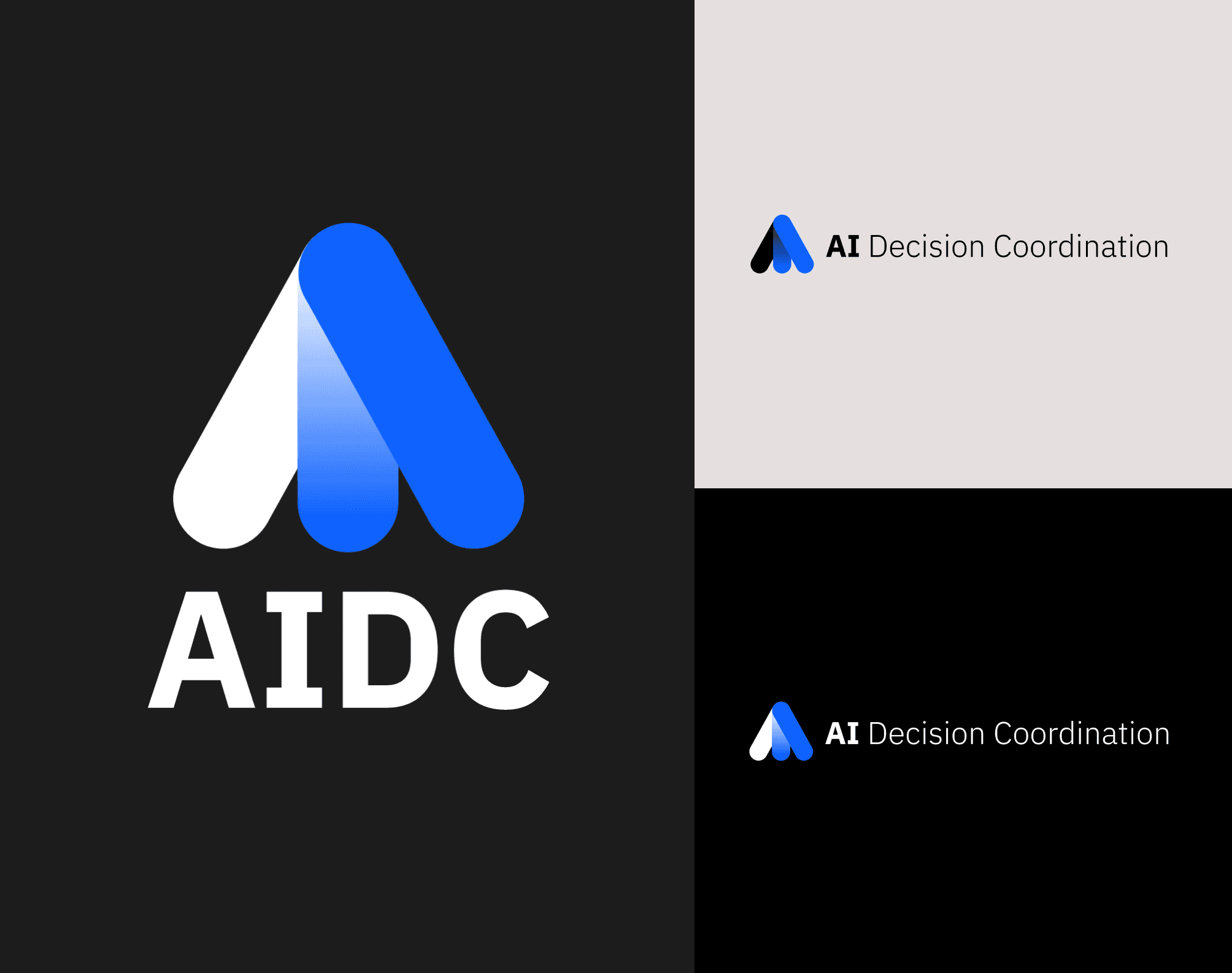
Exploring different directions

💭
Showing a full range of dark, light, and monochromatic versions of themes helped illustrate the full scope of the logo.
💭
Three core directions were created in which each one focused on a concept.
04 — DELIVERY
Setting up teams for success
The final delivery was a set of brand guidelines and a collection of assets available for use right away.
Brand Guidelines
A brand guideline document was created for each concept as a tool and reference for both visual expression, but also verbal guidance.

Assets
Branding assets for essential lock ups were created in different formats and sizes.


Feedback

06 — RETROSPECTIVE
What did I learn?
It doesn't have to be finished for it to be shown
With such a tight turnaround time, it was important to get feedback often. I found that a half baked idea that still communicated a concept was enough to get eyes on.
People loved being involved
Regardless of their design skill, teams really liked being involved in the process. Leaning into their enthusiasm and presenting work often allowed teams to feel like the end result was a representation of everyone's effort.
A single source of truth keeps everyone aligned.
Everyone has their own taste and opinions. The most effective way to make meaningful progress was to use the branding homework document as a source of truth which helped stakeholders express concerns and ideas from the point of view of the brand, before defaulting to their own personal opinion.