
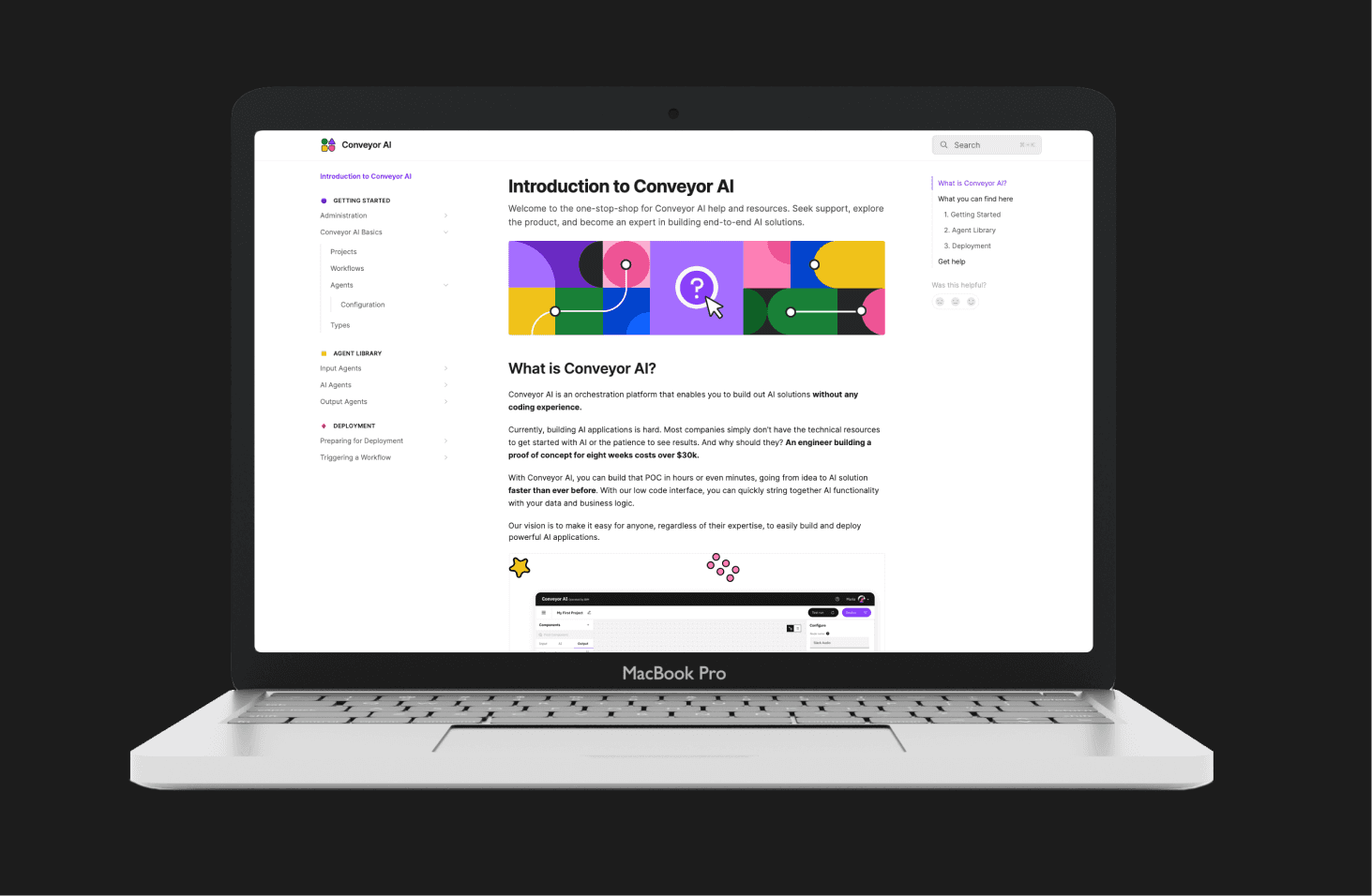
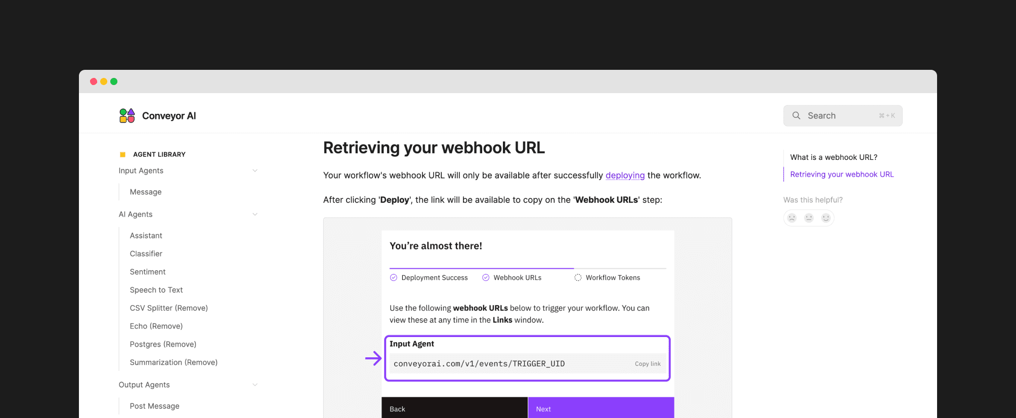
A documentation website for onboarding and troubleshooting
TIMELINE
5 weeks (Patterns)
3 weeks (Individual)
ROLE
Design Focal
Content Designer
Illustrator
TEAM
4 designers
1 researcher
1 product manager
1 design/content lead
SKILLS
Content Design
Visual Design
Design Leadership
01 — OVERVIEW
How might we support novice users to maximize their value with Conveyor AI?
Conveyor AI is a low code orchestration platform that enables users to build out AI solutions without any coding experience. The help and documentation website as a deliverable was the effort of a cohort of IBM's early professional design career program, Patterns.
I served as the Design focal supporting a team of 4 designers and 1 researcher.
PROBLEM
Technical support resources are limited. Both current and new users need a way to independently learn about Conveyor AI and troubleshoot issues as they use the product so that can maximize value.
OUTCOME
I delivered copywriting, illustrations, and diagrams for the first iteration of the help and documentation website.
02 — PHASE ONE: DESIGN THINKING
From problem space to solution proposal
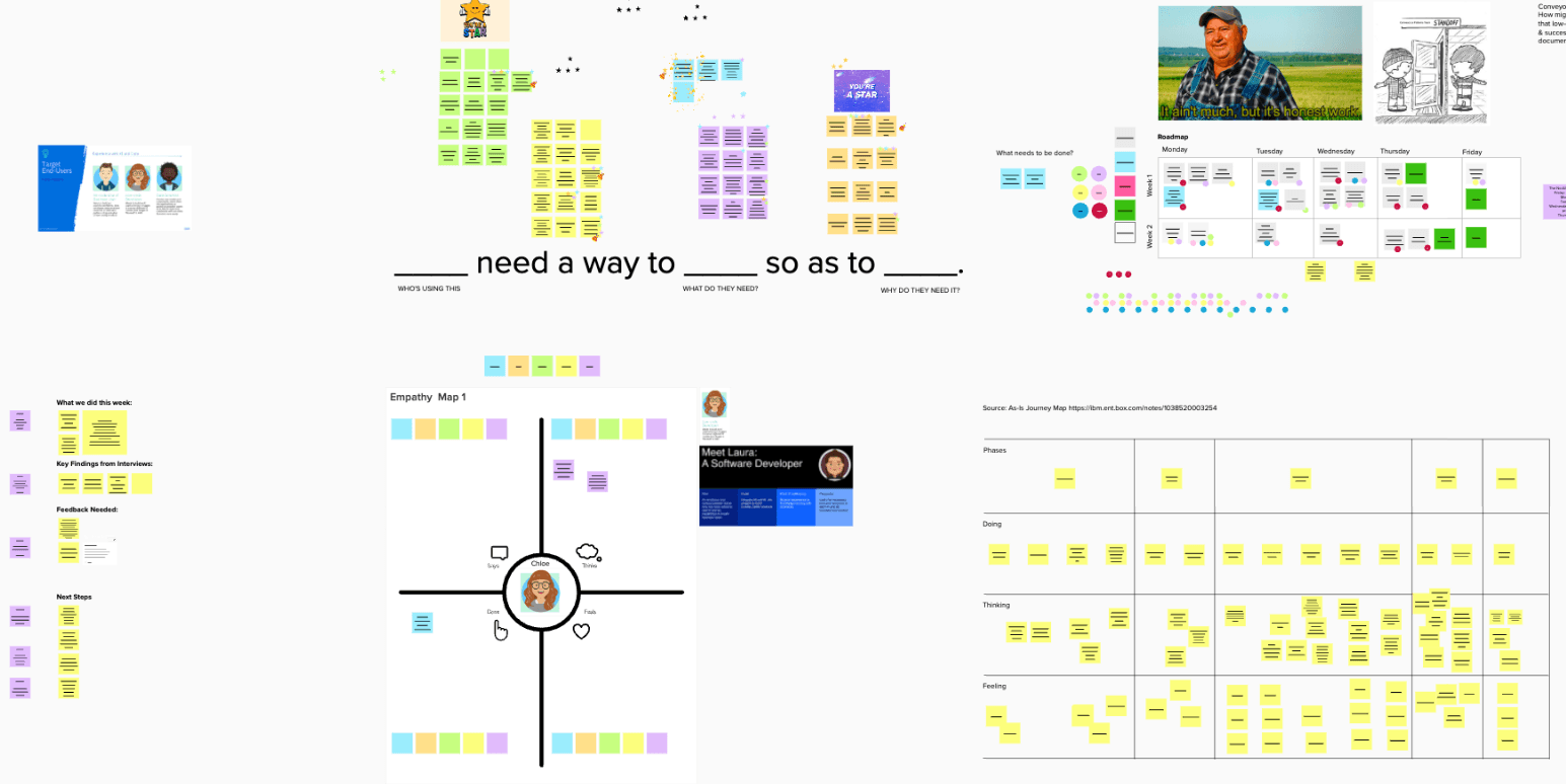
The team engaged in Enterprise Design Thinking activities to produce deliverables like empathy maps, as-is / to-be scenarios, needs statements.
My contribution as Design SME
🌟
Act as a liason between Patterns participants and core development/product team
🌟
Lead organization of program deliverables, onboarding, and 4-in-a-box office hours
🌟
Lead meetings to provide feedback, guide direction of work, and discuss design decisions
🌟
Source sponsor users for user research activities
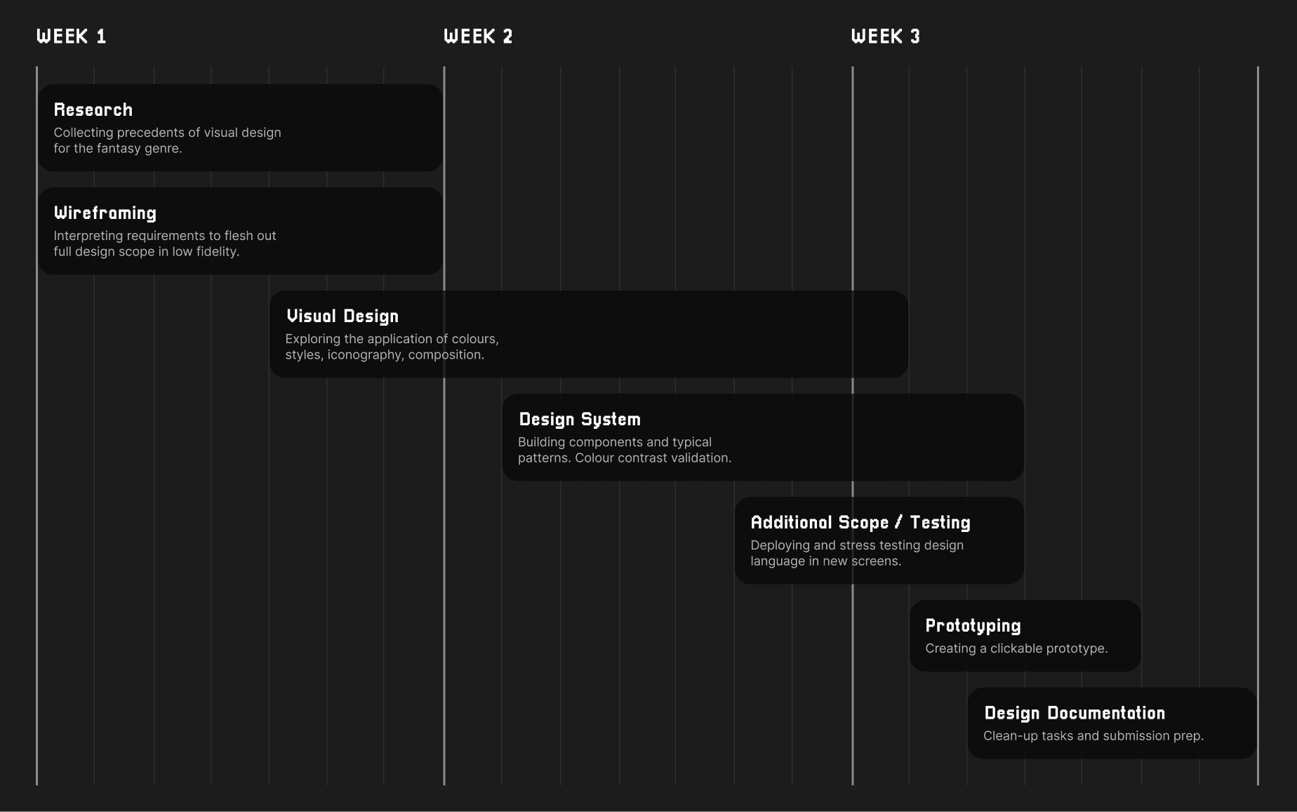
Timeline: Patterns Program
Feedback

03 — PHASE TWO: CONTENT DESIGN
Populating the documentation solo
After hand-off from the Patterns cohort, I took over the project as a solo designer to populate the content of the documentation website and see the project through to delivery.
North Star principles
🌟
Write in plain language to support the discovery and understanding of solutions.
🌟
Break down complex tasks and systems into simple steps.
🌟
Leverage visuals for faster information communication.
🌟
Treat the documentation as an extension of the product user experience.
Timeline: Solo
Information Architecture
The information architecture was organized to match the end to end flow of a user - from understanding the product to building a workflow to deploying and maintaining.

QUESTIONS IN THE USER JOURNEY
💭
I pulled in PM and Development to collaborate in populating common/important questions in each stage of a high level user journey.
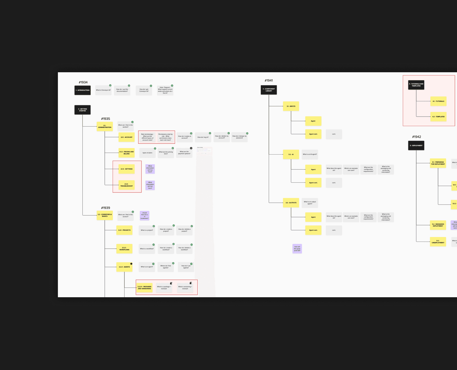
FINAL INFORMATION ARCHITECTURE
💭
This exercise helped create and order major sections of the documentation, broken down into subpages.
Content Writing
Writing was also a collaborative effort that looped in technical team members to ensure accuracy. My priority was maintaining an approachable reading level while communicating enough information.
04 — SUPPORTING VISUALS
Supplementing the text with supporting visuals
I created supporting visual assets for concepts in the documentation. They serve to clarify the UI and balance the information density of text heavy pages.
Illustrations
Illustrations served to simplify product objects and concepts. Colour was used to group concepts according to their sections.

SECTION HEADERS
💭
Section headers incorporate branding and identify elements while maintaining a shared design language.

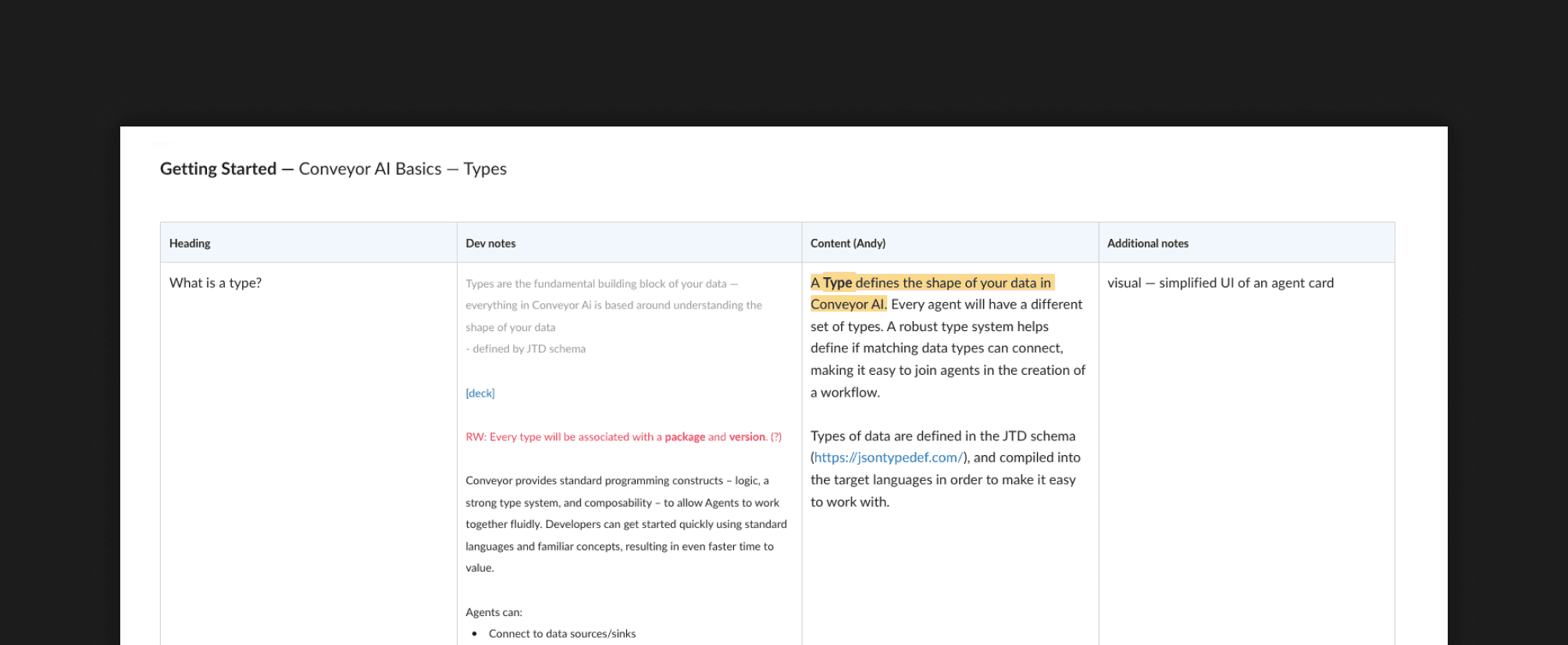
DEFINITION ILLUSTRATION
💭
UI elements are simplified to describe components and their hierarchy in relation to each other.

Diagrams
Diagrams were created to annotate the UI for a more technical breakdown of common elements.
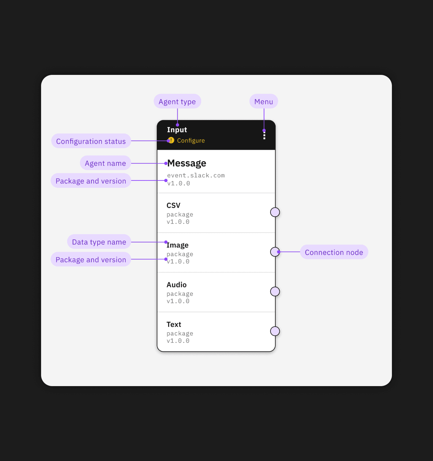
CARD ANATOMY
💭
Complex UI elements are broken down and labelled to clearly identify the location of key terminology.
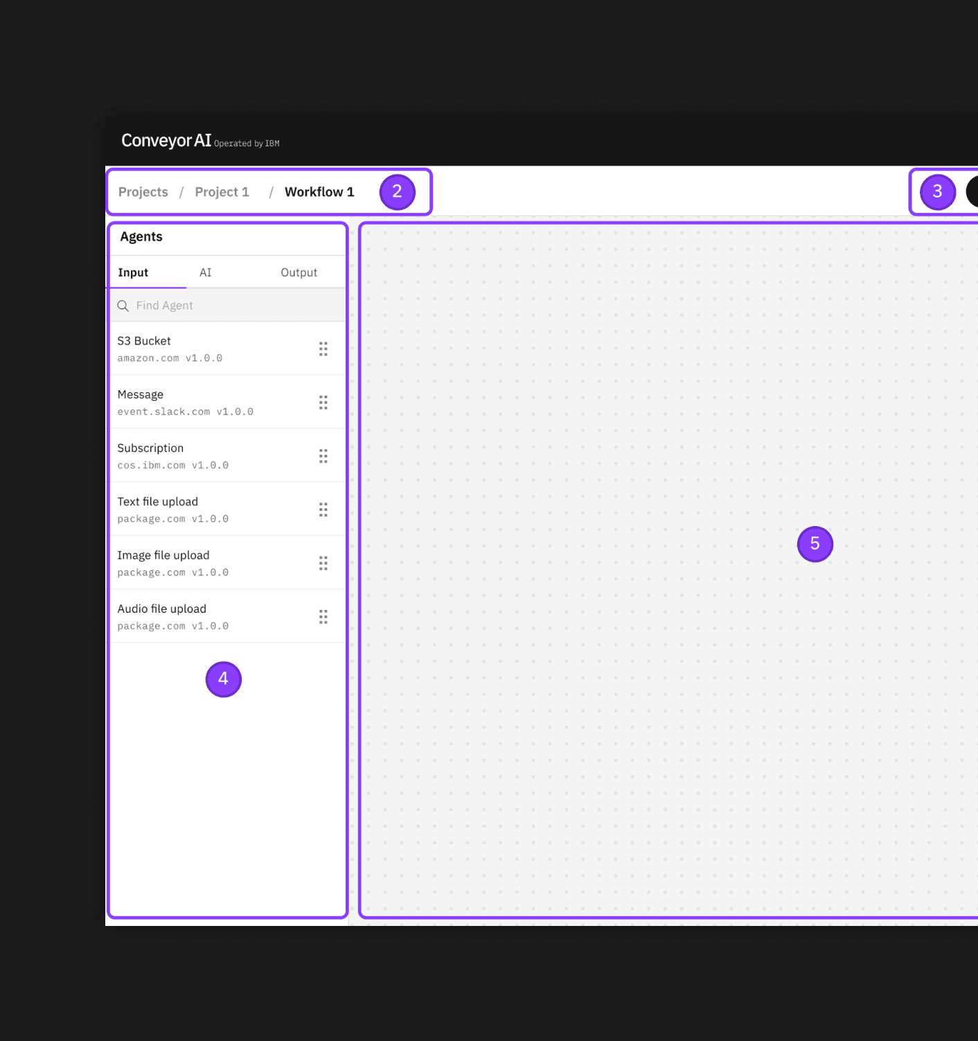
UI BREAKDOWN
💭
Main UI sections are labelled as a visual supporting tool.
05 — POINT OF ENTRY
Making it all accessible from product
The product UI was evaluated to identify the key opportunities where users will seek clarity for need to be directed to the documention.

BEFORE
❌
'Learn more' was direct and visible but created visual distraction. It was unclear what element of the modal it was referring to.
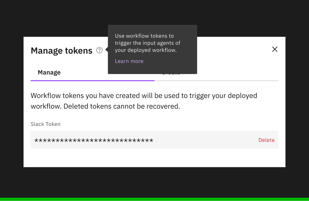
AFTER
✅
Leveraging a tooltip provides an opportunity for a brief description and makes it clear what element the link is associated to.
06 — RETROSPECTIVE
What did I learn?
Teams come and go
Transitioning from a leadership role to a sole contributor for the same project was a unique experience. I learned the value of cross-functional communication.
It's all in flux
Documentation is a living artifact. I had to be mindful of how might this content update and change, and how to make that process easy for the next contributor. An artifact designed to be edited routinely indefinitely is a constraint that must be considered at the get-go.