A user interface and visual design exercise for a fictional mobile fantasy video game
TIMELINE
Nov 2023
3 weeks
ROLE
Designer
TEAM
Individual
SKILLS
Visual Design
UI Design
Design Systems
UX Design
01 — OVERVIEW
How might a user interface express the spirit of a game?
Final Fury XXIII is a design project completed for INF2164H — UX Research and Design for Video Games. This project serves primarily as an exercise for UI and visual design in mobile gaming, supported with UX design and research.
TASK
Translate rigid specifications and guidelines for a fictional first-person fantasy role-playing game into a functional experience with a compelling visual style and brand.
OUTCOME
I designed a menu and HUD elements to fulfill concrete game mechanics, defined a design system and visual language, and delivered a clickable prototype of a sample interaction sequence.
02 — REQUIREMENTS
Understanding the scope
The brief prescribed the game specifications, premise, and the detailed breakdown of a secondary system for unique Abilities to enhance combat of the player character.

North Star principles
🌟
Keep UX as an underlining priority to inform UI
🌟
Leverage typical patterns from the mobile RPG genre
🌟
Make every visual design decision support the game concept
🌟
Have fun with it!
Timeline
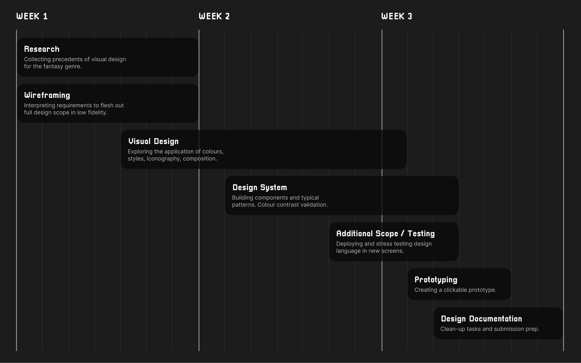
03 — RESEARCH
Avoiding the reinvention of the wheel
As a starting point, I did lightweight research to identify pervasive visual themes and UX design patterns used in the fantasy RPG genre. Many insights revolved around managing the effective communication of information, given the complexity of RPG content.
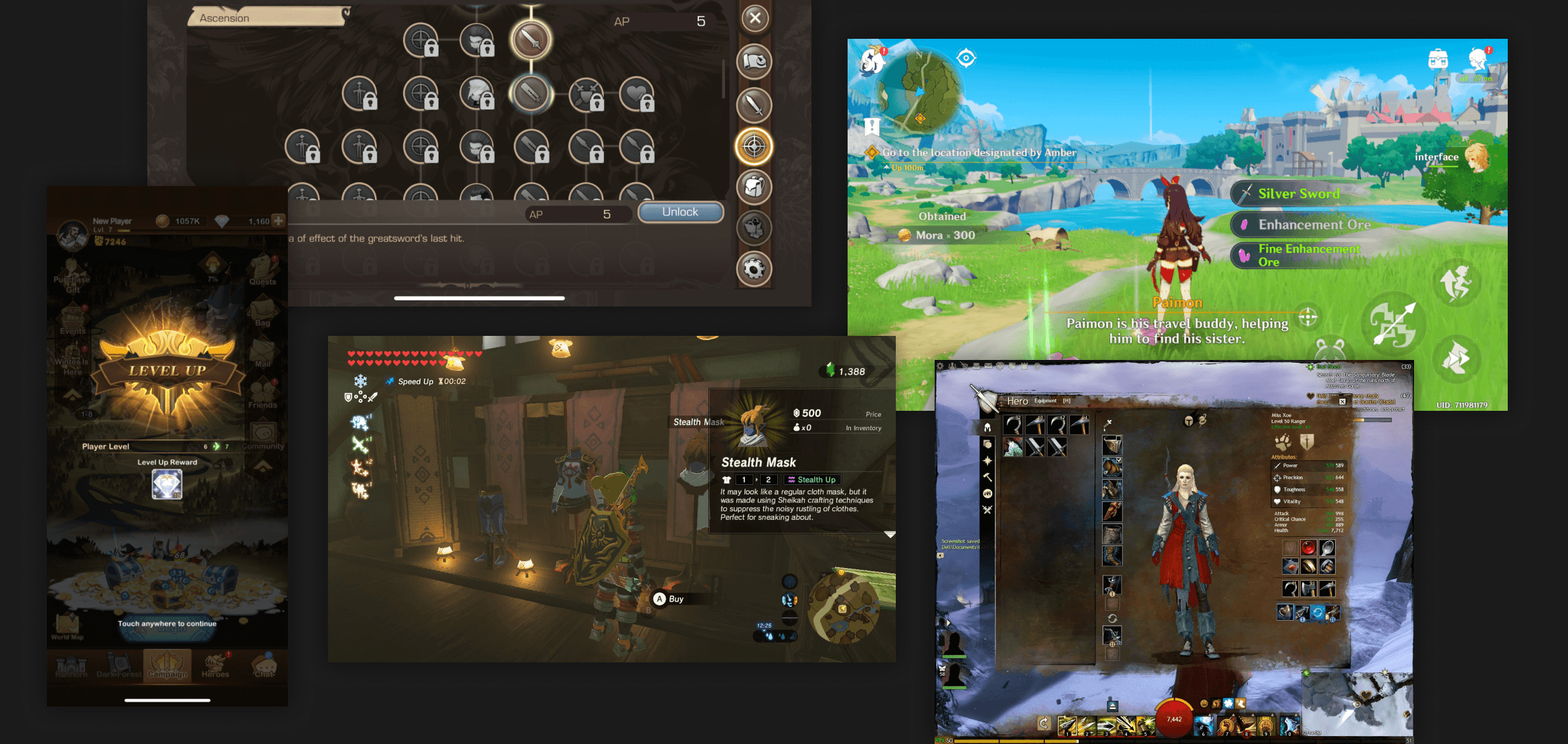
💭
The fantasy genre is best expressed in serif typefaces, but sans serif type is best for communicating information in dense circumstances.
💭
Glowing visual language signifies an active state, key symbol, or meaningful interaction.
💭
Vibrant colours outside the scope of brand colours are used sparingly and intentionally to communicate key information.
💭
Information hierarchies must be clearly defined considering the types and ranges of information present at once.
04 — DESIGN ITERATIONS
Wireframing the basics first
To make sense of dense written requirements, wireframes were produced to understand what visual decisions had to be made. Pretty unglamorous but definitely useful!

A set of low fidelity screens allowed me to begin UI design with the confidence that major systems and patterns have been identified.
Iconography

EARLY EXPLORATIONS
❌
A single colour as the primary differentiating element is single-dimensional and difficult to scale
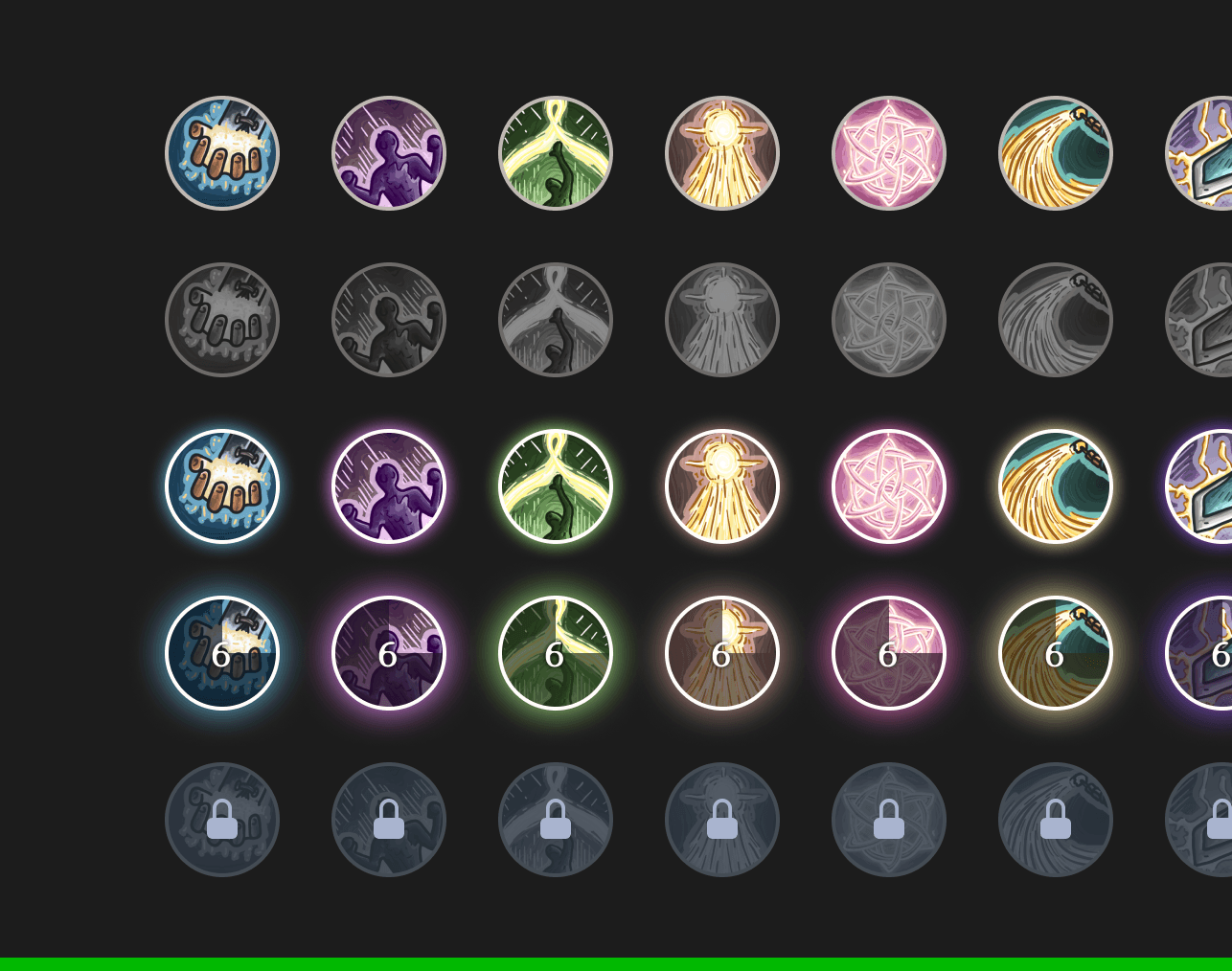
FINAL ITERATION
✅
The use of illustrations gives each ability a unique character that still allows colour to be the differentiating element
✅
Desaturation helps clearly communicate an inactive/locked state
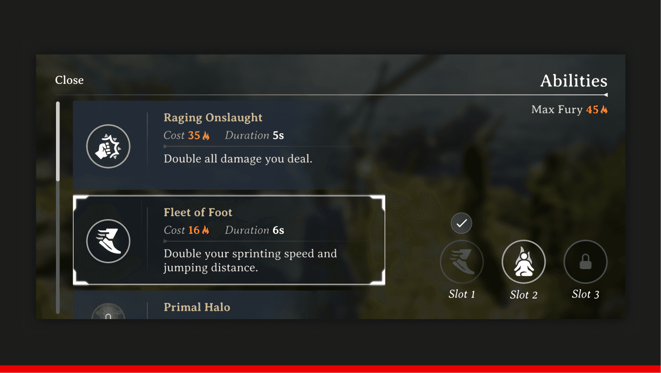
Abilities menu
EARLY EXPLORATION 1
❌
Only two cards are ever fully on screen at a time

EARLY EXPLORATION 2
❌
Ability card lacks visual presence over secondary information
❌
Poor hierarchy and contrast between abilities and slots
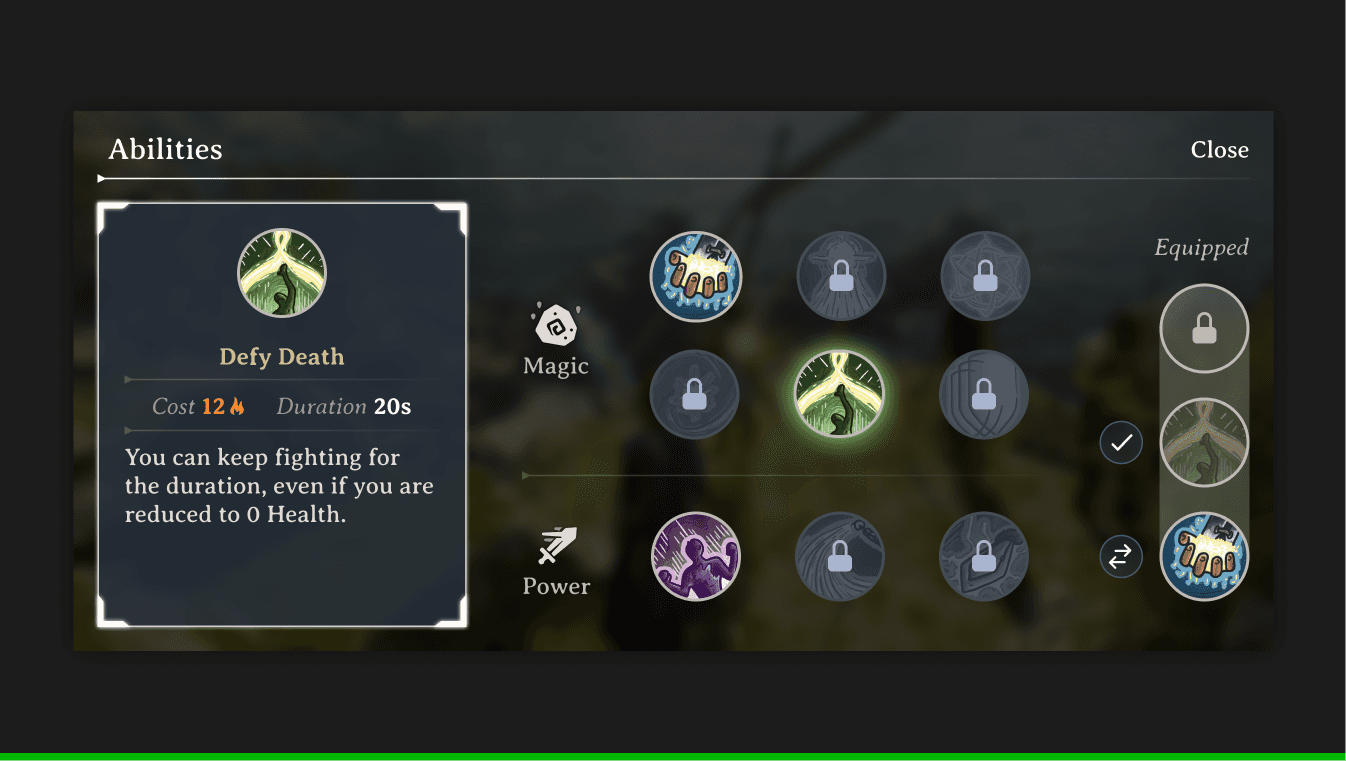
FINAL ITERATION
✅
Portrait oriented card gives more room for variable text lengths
✅
Icons instead of words for equipping the abilities minimizes the text on the screen
✅
No scrolling required
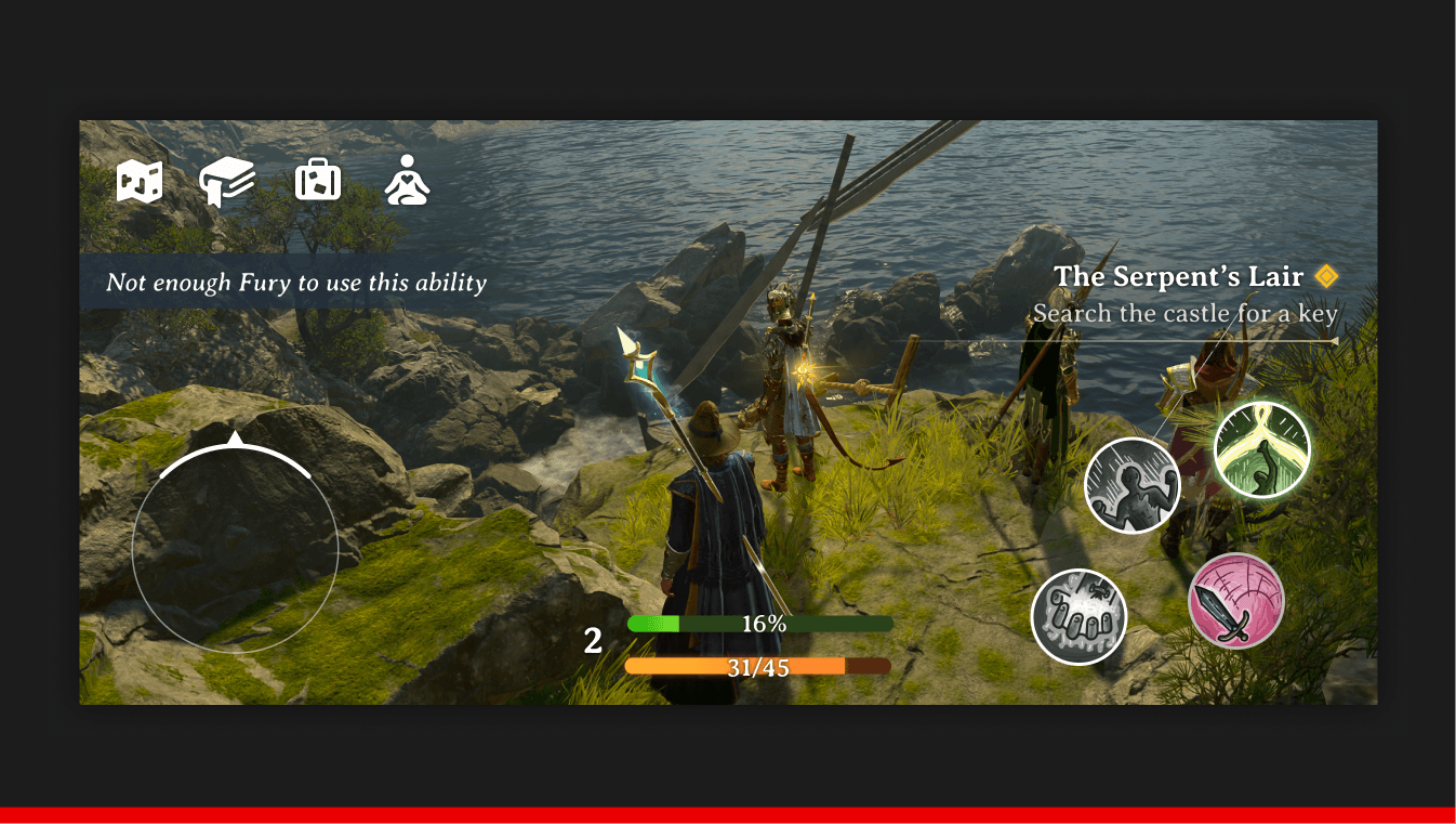
Heads Up Display (HUD)

EARLY EXPLORATION 1
❌
Imbalanced screen content density between left and right sides.
EARLY EXPLORATION 2
❌
Better balance but lacks space for a map view.

FINAL ITERATION
✅
Clarity between 3 abilities and the default attack button
✅
Only essential information present.
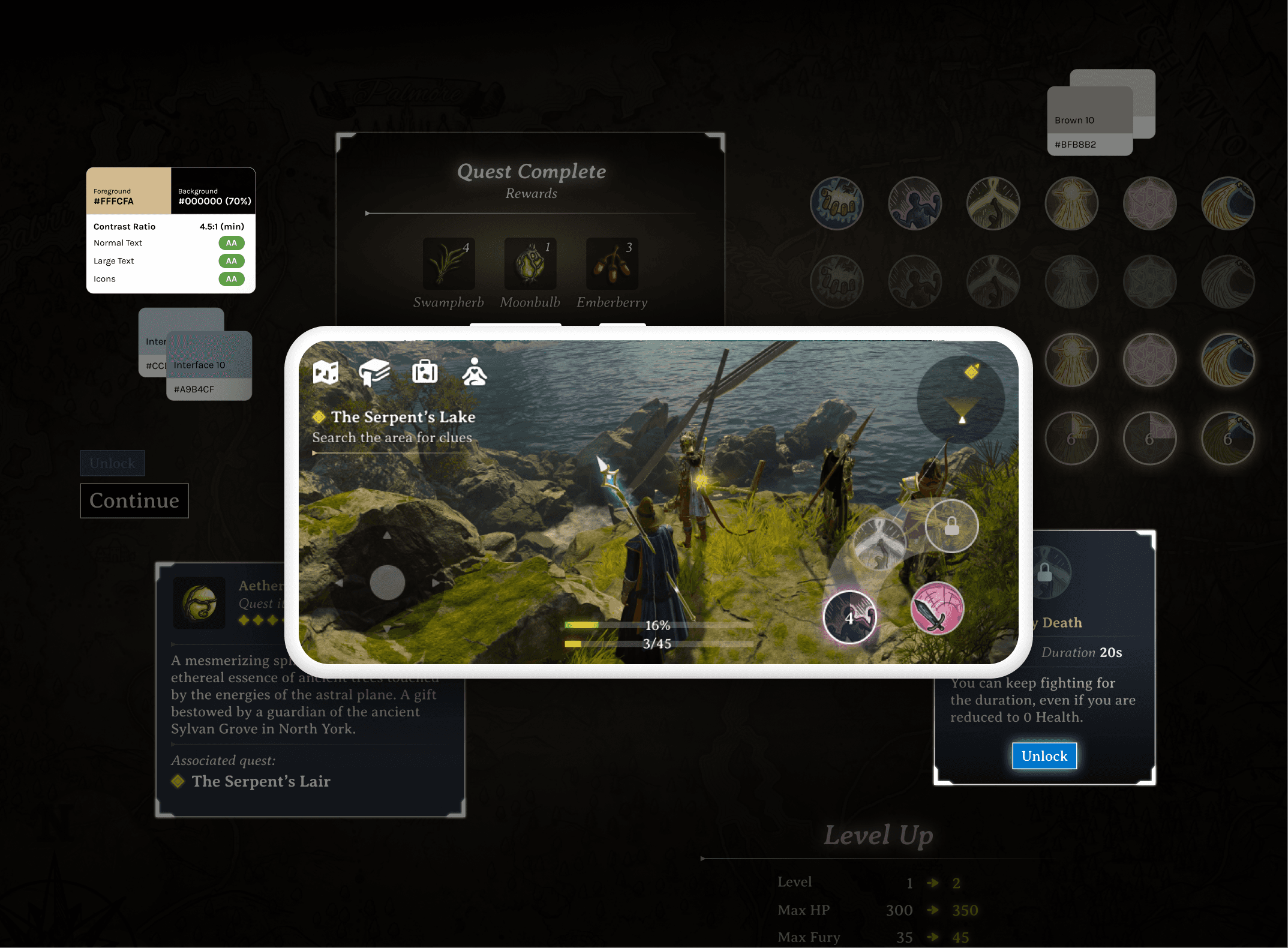
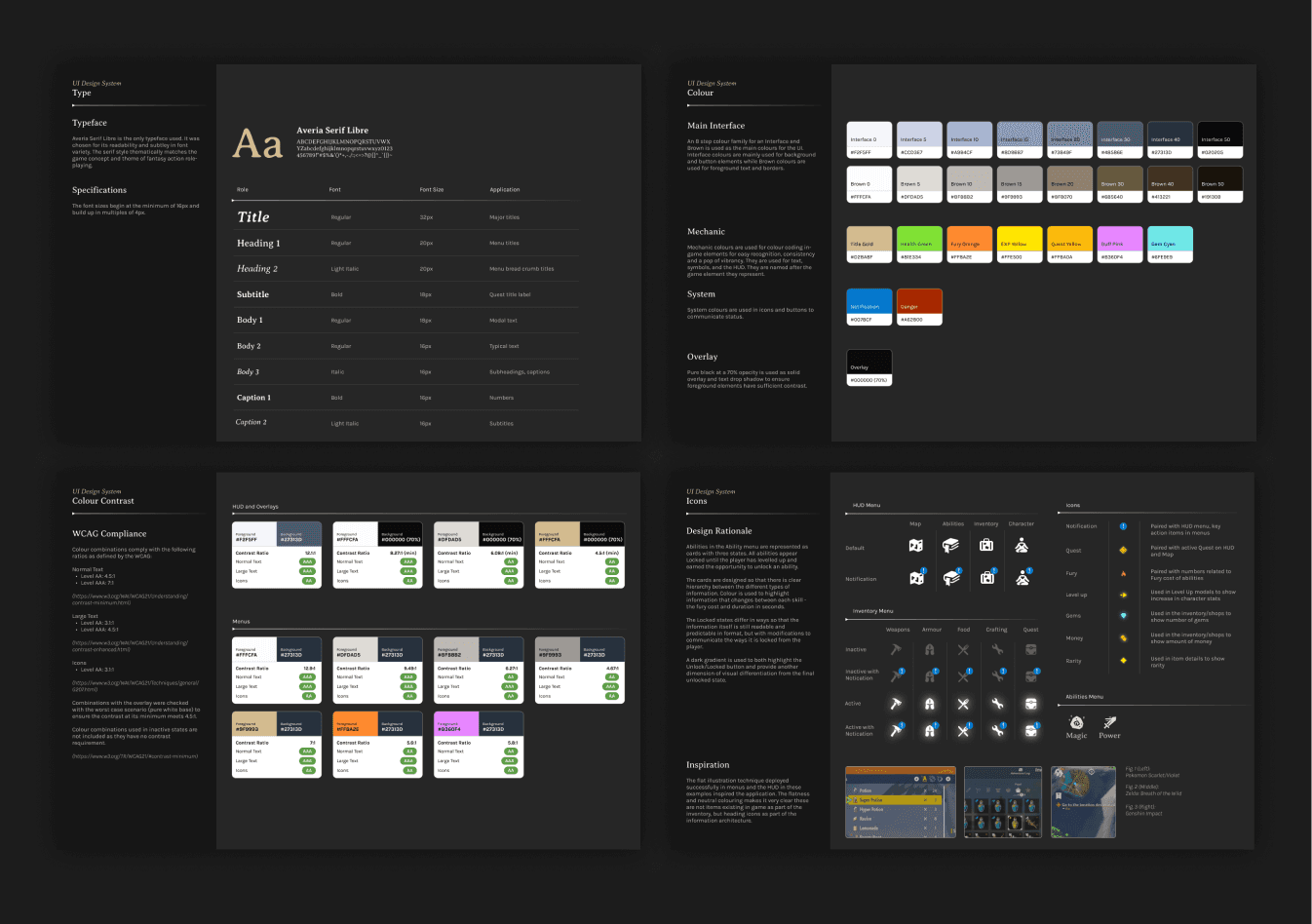
05 — DESIGN SYSTEM
Building out the visual language of Final Fury
I fleshed out a design system of essential elements that allowed me to iterate on design patterns faster, knowing that font and colour combination contrasts we all validated and consistent.
A concrete design language helped me explore other screens to validate each element outside of the scope context.

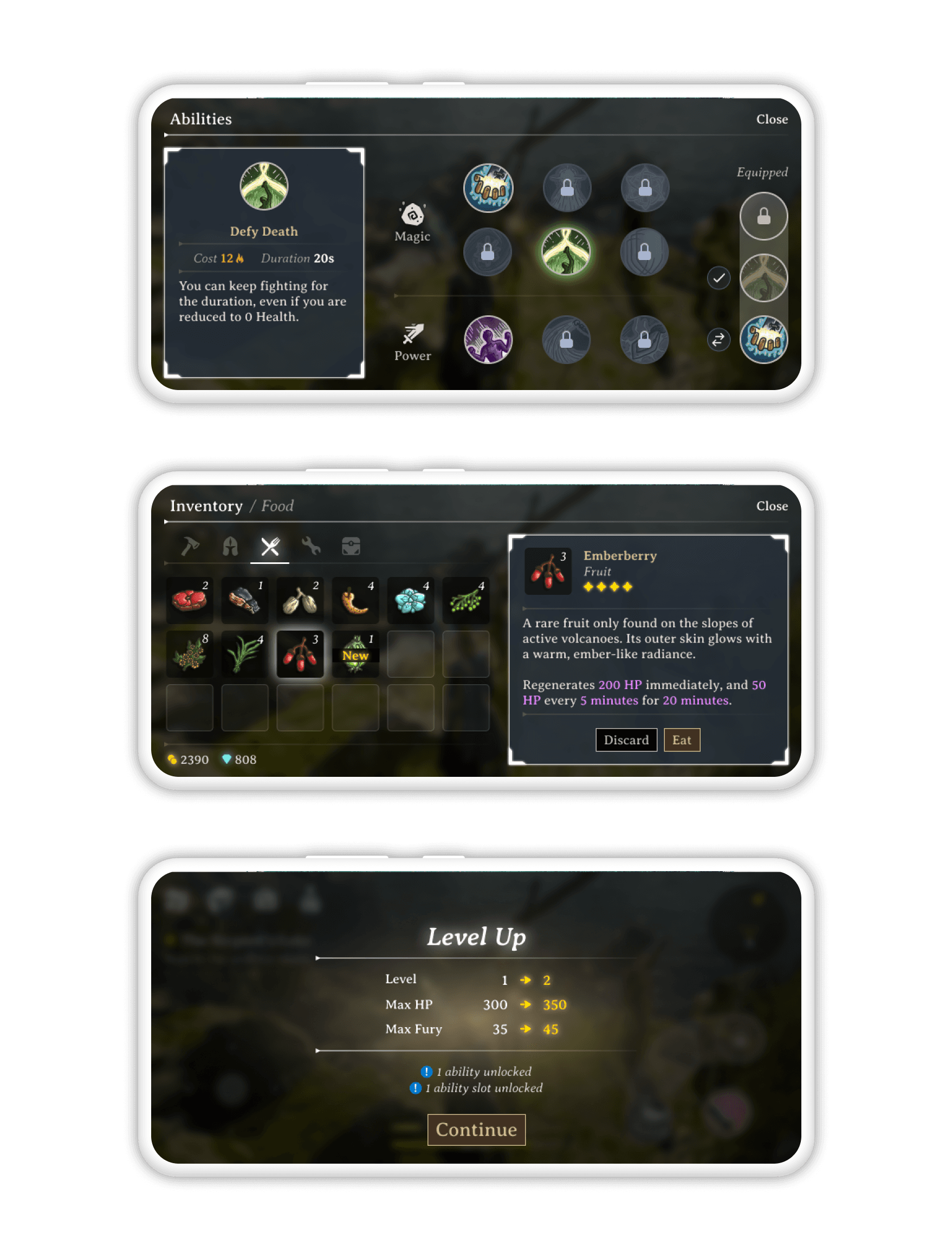
06 — FURTHER EXPLORATIONS
Deploying the visual language
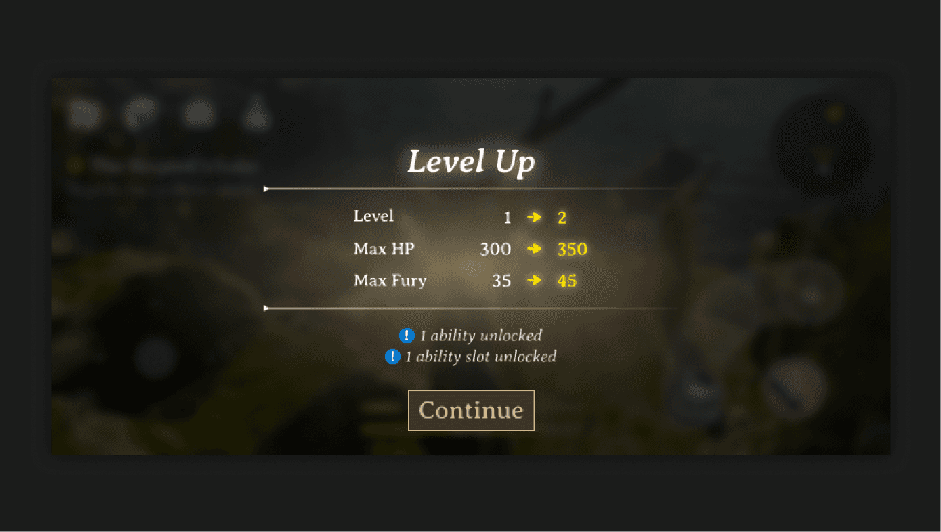
LEVEL UP
An exploration on tactical use of colour and how to communicate important information.
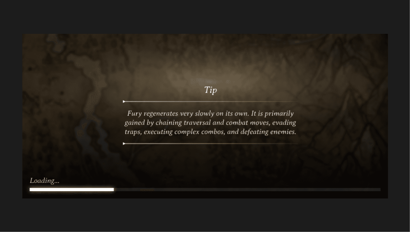
LOADING
An idea I had for leveraging concept art while communicating helpful tips.

INVENTORY
Exploring another main menu and reusing the card component in a different context.

QUEST COMPLETION
Mixing the use of buttons, items, and windows in a common context of quest completion.
07 — RETROSPECTIVE
What did I learn?
There is no UI without UX
While not explicitly an exercise for UX, I found that it was impossible to strictly focus on UI in a silo. Thinking about players' motivations and anticipating their pain points was essential for decision making on UI elements.
A broad scope gets you focused
Extending my original scope in turn strengthened the quality of the entire design. Keeping in mind the different contexts UI components must live and be functional allowed me to design with intention and meaningful constraints.